
Do you have a strong, clear visual brand that aligns perfectly with your ideal customer? If you’re reading this then I suspect that you either want to refine your visual brand or create one from scratch. If so, then in this article I’ll cover some of the visual brand tools that you can use.
What is your visual brand?
Each time I work with a regional business I ask what their visual brand looks like. Each time I’m presented with a logo…. and I’m left wanting more as so many businesses don’t have a comprehensive visual brand or digital style guide.
Without a comprehensive visual brand you risk becoming lost in the ‘noise’ of the noise of the digital landscape with inconsistent (or even competing) messaging and you waste valuable time in creating content from scratch each time you produce something.
Don’t be that business anymore!
Instead, take an hour today using the following tools and create your own visual brand and digital style guide ONCE so that you can refer back to it easily time and again.
Creating a Visual Brand is Hard!
No it’s not!
Well it can be if you want to complicate it.
Here are three different scenarios that I see regional businesses in all the time:
- You have a logo that someone created for you and that’s it. Each time you want to create a brochure, or a sign, or even craft an email it takes you 5min to find a red that’s “about right”, and another 10min to remember what font you used last time. Then you pull out the last two documents you created and spend extra time styling it to look at least related in look and feel. After it’s published you realised that it looks worlds apart from that other document you did last month.
- You have some brand guidelines but “designing” isn’t your thing. Each time you give it to the young(er) girl you have working for you and compliment them on doing a far better job than you ever could. But when you read it out aloud it doesn’t really sound like you.
- You took the time early on to work with a brand strategist. You actually have a visual style guide on the shelf in the office. It talks about fonts, colours, variants, and lots of other more complex phrases that you won’t repeat here for fear of letting on that you have no idea what they mean. But you still feel stuck as you have no idea how to use that Pantone colour in Word and you’ve never been able to find that Truetype Font (but you have something else that’s close).
Does this sound at all like you? If so, your visual branding doesn’t have to be that complex.
Instead it can be as simple as having:
- A logo
- A set of 3-4 colours that you can use anywhere
- One or two fonts that are consistently used (and you can access)
- A description about the voice/tone that you use
- Any specific visual layout guides that you regularly use.
If you gave me those five things, as a web developer, I would be over the moon!
The Method
A Logo
You probably have one already. If you do, skip down the list.
If not then you’ve got some options.
Personally, I suggest that any business that is less than two years old just uses their business name in a nice font. There’s several reasons for this.
In the early stages of a business most customers will “stick” with a business because of YOU, because of the quality of service that you provide to them. You’ll be leveraging referrals, or walk-ins (if you’re in town). People won’t choose to work with you because of your logo (or lack thereof).
The other reason is that you’ll most likely develop your brand within the first two years anyhow. There’s no need to invest time and money into a logo yet if it’s only going to change next year.
If you really want to have your own logo developed though you can:
- Chat with a local designer or brand strategist.
- Fill out a questionnaire and offer a prize on logotournament.com. Hundreds of designers will offer logos and you just choose the best.
Having logos in a variety of sizes, shapes and backgrounds is really useful.
Brand Colours
Here’s a funny story. My partner and I were driving through Chirnside a few weeks ago and we’d stopped at the lights. My partner looked up and said “oh, they must be building a Dan Murphy’s there!”. At the time you could only see a concrete shell, and part of the facade had been painted green. That was it. No signage that we could see, no logos… just green paint. That’s how strong a brand colour can be.
The Dan Murphy green is only strong because it’s used every time and that association is powerful.
You too can associate a colour or two with your brand if you use the same colours consistently.
I’d suggest that you speak to a designer or a brand strategies as there’s lots of psychology to colours in brand marketing.
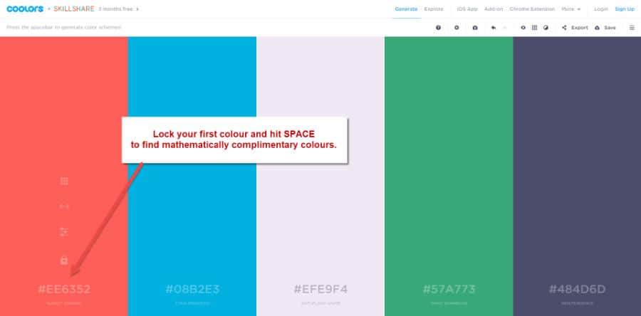
But if you want a simple way of pulling together a colour palette that works together you can’t go past Coolors – the super fast color schemes generator.
Fonts
Again, a designer or a brand strategist can help a lot here too. But you can also look choose a couple of complimentary fonts yourself.
Firstly, be aware that there are lots of font libraries out there, and that it’s worth looking at the fine print if you are licencing premium fonts (no you can’t just buy a font and use it everywhere).
I love using Google Fonts (yes Google has their own font library). The main reason is that there are so many other online tools that also use the Google Font library making it easy to use the same font on your documents, in the images you post on social media, on posters, business cards, etc. Check out the entire Google Font library for inspiration at fonts.Google.com.
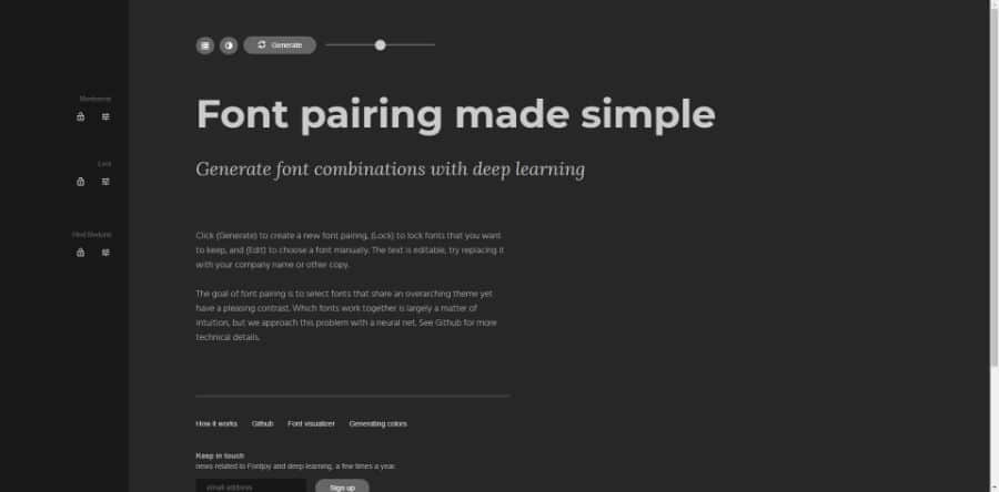
Once you have found a couple of fonts that you like head over to either Font Pair or Fontjoy and get some inspiration for how to pair them.
In fact, Fontjoy is much the same as Coolors in that you just lock a primary font and it will suggest up to two different fonts that are complimentary.
Tone and Voice
I don’t have a funky tool that will help you craft your tone and voice instantly. But what I can do is point you to the following three articles that describe how to think when you’re writing yours.
- The GatherContent article titles A simple tool to guide tone of voice is a very short and digestible article and a great place to start.
- Content Marketing Institute has a wealth of articles, and the one titles 5 Easy Steps to Define and Use Your Brand Voice gives literally that – a 5 step blueprint to craft your own brand voice.
- Want to take it even further? Finding Your Brand’s Voice on the Distilled blog does a deep dive into how to craft your brand voice and how many other successful brands have thought about crafting theirs.
At the very least, keep a small file on your computer with a sample of your collateral. That way you at least have a reference point to go back to.
Do’s and Don’ts
After a few final hints?
- Keep it simple. While there’s lots of tools and ideas above it’s easy to get lost down the rabbit hole. The best brands on earth are simple and recognisable.
- Put all the pieces together on a single reference page (a digital style guide), print it out and keep it next to your desk. The most important thing here is not what colours and fonts you use, but that you use them consistently!
- Share the digital style guide with anyone else on the team who needs it.
- Don’t give the job of creating your visual brand to the work experience kid. The best brands are made in consultation with all parts of a business, but at the very least I reckon you need to steer the design.
What now?
Get designing!
Actually, I suggest blocking out a half hour today to play with some of these tools and to come up with a palette of colours and fonts that you want to use and then put it away for a week (or at least a few days). Then come back to it, perhaps even invite some comments from a friend, and start working through revising your visual brand.
Once you’re 90% happy with it, write it down and start using it. Or, if you’re reading this because we’re working on a website project together then flick it over to me and I can start applying it to your website for you to see in situ.
But now over to you…. what are your thoughts? How do you define your visual brand? Have you used another tool that you thought was useful?
Let me know in the comments below.


