
I spent six months looking for the right client portal.
Then I built it myself.
Picture this.
Your organisation has a website care plan with a local agency. Reports arrive every month… updates on what’s been fixed, what’s been improved, how your traffic is trending. They’re useful. You read them when they land, then file them away… somewhere.
Three months later, your board chair asks how the website is going. You want to show some progress. So you go looking. Is it in email? Which folder? Was it a PDF attachment or a link? You check with your secretary, who thinks she saw one but can’t find it either. Your treasurer remembers something about a new Google Reviews widget but has no idea where the write-up is.
You know the work is being done. You just can’t show it.
This is the problem I kept hearing from clients, and honestly, kept experiencing from my side of the relationship too. I’d spend hours producing a thorough monthly report, send it off, and watch it disappear into an inbox. The value was real. The visibility wasn’t.
Six months of looking for the right tool
Before building anything, I spent the better part of six months trying to find existing software that solved this. I trialled Motion, Outlign, SPP, Kitchen, and a handful of others. Each was good at parts of the problem: task management here, client communication there, document storage somewhere else.
But none of them were quite right. Too complex for clients who just want to check in occasionally. Too opinionated about workflows that didn’t match how I actually work. Too expensive for what they delivered.
And there was one problem none of them could solve cleanly: user management for the way my clients actually operate.
Some of my clients are a single person running a business … one login, straightforward. But others are community organisations or committees where three or four people all need access to the same dashboard. A president, a treasurer, an admin officer – they each have a legitimate reason to log in, and they shouldn’t have to share a password or ask someone else to pull a report on their behalf.
On top of that, some clients manage multiple websites under one care plan… a main site and a campaign site, or two brands under the same organisation. The platform needed to handle that cleanly, without clunky workarounds.
Off-the-shelf tools all made assumptions I couldn’t work around. So eventually, I built it.
What the dashboard actually means for you
The features are one thing. But what I really care about is what they mean day-to-day: so let me explain it that way.
You’ll never lose a report again. Every monthly report lives in your dashboard, organised by year, available to download any time. No inbox archaeology, no asking me to resend something from eight months ago. It’s just there, permanently, whenever you need it.
You always know what you’re paying for. Your care plan details are right there in your dashboard, exactly what’s included, no ambiguity. After 18 months you shouldn’t have to dig out a welcome email to remember what’s covered. With the dashboard you don’t have to.
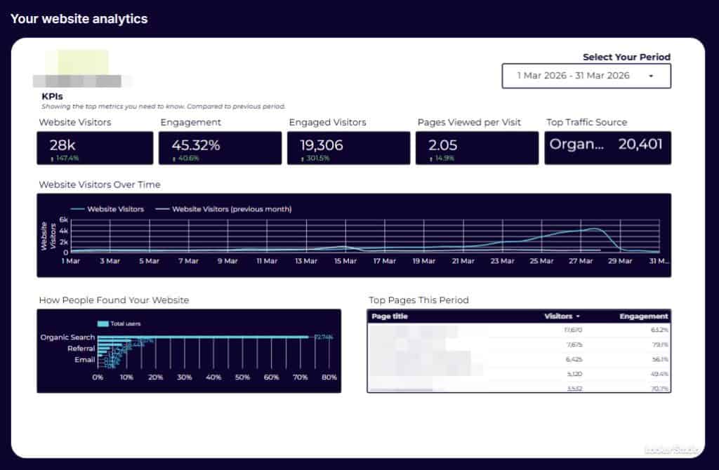
Your website data, without the extra login. Your analytics are embedded directly in your dashboard. You don’t need a separate Google account or a separate tool to check how your site is performing. It’s your data, in one place, every time you log in.
You can see what’s actually been done this month. Not just in the formal report, there’s a Quick Wins panel that surfaces the smaller improvements that don’t always make the headline. The click-to-call button that now works properly on mobile. The slow page that got faster. The small things that accumulate quietly but add up to a noticeably better website over time.
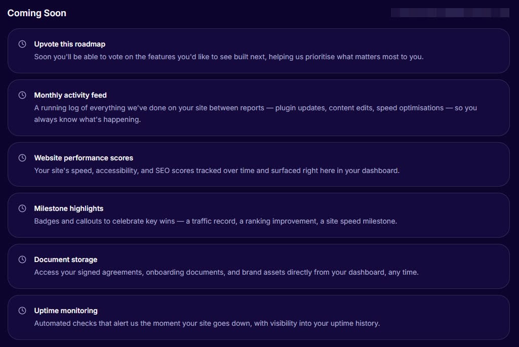
You know what’s coming. There’s a live roadmap so you can see what I’m working on next, for your site and for the dashboard itself. I think clients deserve to know where things are headed, not just where they’ve been.
You have one place to ask for things. There’s a built-in support form for submitting requests: priority, type, description, any relevant URL. No wondering whether to send an email, a text, or a Facebook message. One place, every time, and nothing falls through the cracks.
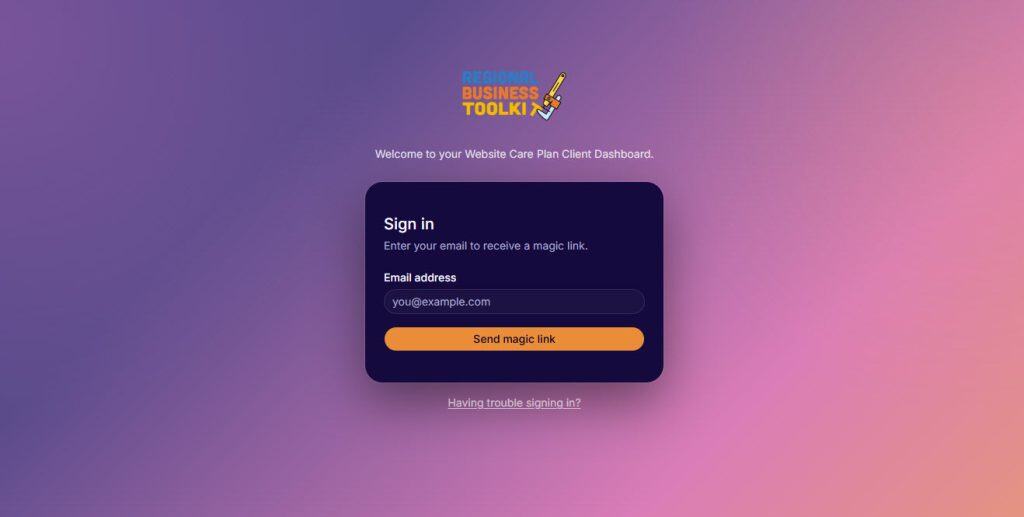
No passwords. Ever.
This one might sound like a small detail but I hear people mention it every time. You log in with a magic link… we send it to your email, you click it, you’re in. Nothing to remember, nothing to reset when you inevitably forget it six months later. Your dashboard is completely private (only you can access your data), and the whole login process takes about ten seconds.
Why I built it
Part of the reason is practical: I wanted a better way to deliver the work I was already doing. A live dashboard is a much stronger container for an ongoing care relationship than a monthly PDF in someone’s inbox.
But the bigger reason is about what a care plan actually is. It’s not a transaction, it’s a long-term relationship. You’re trusting me with something that matters to your organisation, month after month. That deserves more than an email thread.
The dashboard is a permanent, tangible expression of that relationship. It holds the history, surfaces the work, and keeps improving alongside your website. When a new committee member joins your board two years from now and wants to understand the history of your website… it’s all there, waiting for them.
What’s coming next
The dashboard is live and I’m adding to it every month. On the roadmap: a running activity feed of everything done between reports, website performance scores tracked over time, uptime monitoring, and document storage for your agreements and brand assets.
Not on a care plan yet?
The dashboard is included with every Website Care Plan, it’s not an add-on or a premium tier. If you’ve been thinking about getting ongoing support for your website and want to see what that relationship actually looks like in practice, here’s where to start.


